1. Our team will reach out in <30 minutes.
Check your inbox or phone, we’ll tailor your demo to your use case.
2. We build your custom demo
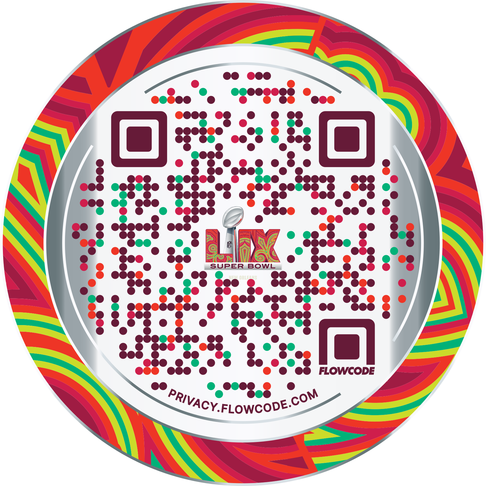
Flowcodes, FlowURLs, and FlowHubs with the data behind the whole platform - so you see exactly what Flowcode unlocks.
3. You go live in days
Our team handles setup. You handle growth.


.png)
.png)
.png)
.png)
.png)
.png)
.png)

.png)
%20copy%203.png)

How We Built an AI QR Code Generator That Drives Better Branding & UX

Irina Zotova
Software Engineer
Updated
August 7, 2025
TLDR –
At Flowcode, we set out to build an AI-powered QR code generator designed for brands, marketers, and creatives. In this post, we unpack key product and UX lessons learned—from model tuning and naming A/B tests to onboarding flows that increase engagement. For anyone designing with AI, QR codes, or building consumer tools, these takeaways can save you time and drive better user outcomes.
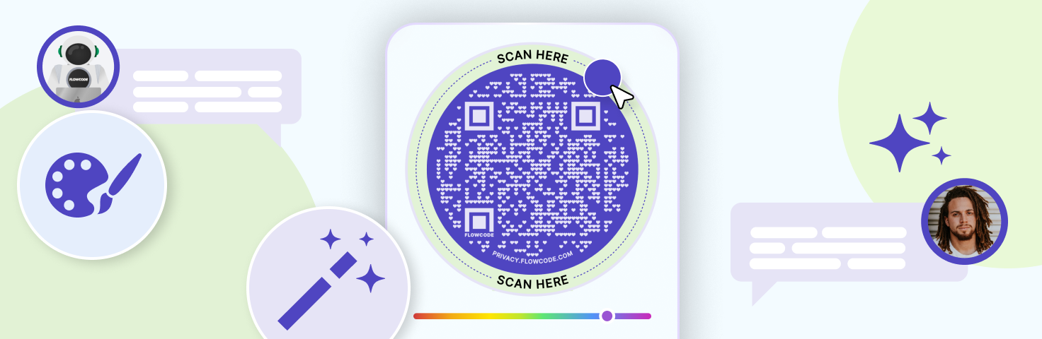
At Flowcode, we built an AI-powered tool to help users design QR codes that align with their needs: for branding, events, or custom creative vision. Our goal was to make the process seamless and flexible and introduce a new approach to QR code design.
You can try it here.

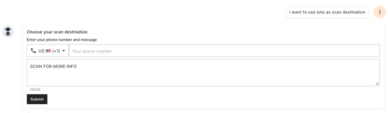
We started with a simple goal: take one sentence from the user and generate a matching design and scan destination. The most common case is designing QR code for a URL, The LLM can use the URL to extract a color scheme and logo directly from the website and use them for the design as well as for the scan destination.
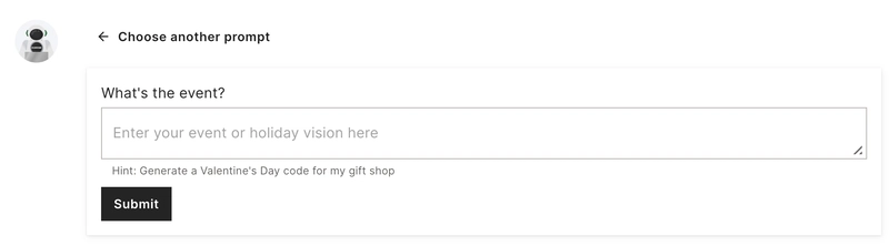
The initial screen displays 4 help tiles and a free-form input field. Most users click a tile to start a dialog. The tiles help users investigate the tool and guide them in structuring their requests for better results. Based on the submitted message, the AI can suggest 4 different design options, provide an answer, ask for additional information (such as a QR code destination or logo image file upload), or improve a previously generated design.
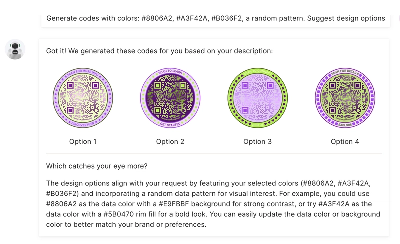
In most cases, users first see a response with four design options. This approach performs best because it quickly shows what the model can do and sparks ideas. Some users are happy with the results right away, while others start customizing: tweaking the design, adding a logo, changing the scan destination, and more.

I would like to share some of our key learnings and provide some context behind how we reached them. I’ll talk about:
- How a slow rollout helped us improve the tool
- LLM testing and the role of A/B experiments
- The huge role that labels play
- Role of UX and new users onboarding
- Model quality
Releasing LLM to real users is the best way to test
Internal users and testers are excellent at identifying bugs. They are familiar with Flowcode’s design, understand the terminology, and are motivated to create visually appealing QR codes. When we asked internal users to test or invited an external participant for a 30-minute QA session with our UX researcher, their approaches were significantly different from the real users. They were motivated to explore the model’s capabilities, challenge the system, and push its limits. When we released the model, we quickly discovered that real users submit very different requests from what we saw before: they use different words, struggle to describe what they want clearly.
Additionally, internal testing sessions tended to be longer and more specific than those of real users. It’s important to remember that you are not the average user — what looks clear and intuitive to you might not work as well for your clients.
The slow rollout
The gradual rollout proved to be highly beneficial, allowing us to analyze how users interacted with the model, the language they used, and any challenges they faced.
Let’s take a closer look at an example.
Can you put the light blue outside, purple in the middle, and the QR code in yellow?
A QR code has different design elements, such as data points, borders, background color, and more. When a user requested specific colors like light blue, purple, and yellow, it wasn’t immediately clear which parts of the QR code each color should apply to. The LLM struggled with assigning colors correctly and asked user for more information. Meanwhile, the user had a clear vision of what they wanted to see, and when the generated output didn’t match their expectations, they became frustrated. To address this, we refined the system to automatically generate 4 different design variations based on the provided colors, even when the input was not clear. This turned out to be one of our most effective decisions. It gave users visual options to choose from, helped align the output with their vision, and created a smoother, more satisfying experience by allowing them to iterate on their preferred design.
A/B Test everything. There are no small changes
Even small changes or text updates can have a significant impact. Take a look at the graph — notice the sharp drop in the middle. The difference between the highest and lowest values is close to 15%. So, what happened?

We decided to test different tile orders and moved the first blue tile to the end. As soon as the A/B test began, we noticed a significant drop in message submission rates. Users who saw the alternative layout were about 15% less likely to submit at least one message to the LLM.
This turned out to be one of the most important lessons from the project: small changes can have a big impact. The problem is, you can’t always predict what will matter. As was said earlier, internal testers often don’t reflect real user behavior, and their feedback can guide you in the wrong direction.
That’s why A/B testing and data analysis are essential. While they may slow development in the short term, the insights they provide are invaluable in building a product that truly works.
Choose the right name
Initially, we named our new Flowcode generator as AI-Design Assistant — a name that highlighted its focus on design, the main goal is assisting users, and the fact that it was powered by AI technology. It seemed like the perfect fit. AI was everywhere, everyone was talking about ChatGPT and other AI advancements—so what could go wrong? Then, we came across two articles: What the data says about Americans’ views of AI and AI with everyday activities. They inspired us to test how users would react to a label with or without the word “AI” in it.

We experimented with multiple name variations and tracked key user behaviors: how many people clicked the link, submitted at least one message to the LLM, and ultimately saved a QR code. The results were eye-opening. Let's look at just 2 very different options:
- AI-Design Assistant received the fewest clicks, those who did engage were much more likely to submit a message and save a QR code. They also really liked the tool.
- Custom QR Design received 2.5 times more clicks and was by far the most popular option we tested. At the same time, users were 10% less likely to submit a message and save a QR code. Still, due to the high volume of users engaging with it, its overall performance was significantly better. Moreover, it provided an opportunity to refine the next steps and further enhance user engagement. Labels shape the experience and define how people interact with the system. As Thomas Gilovich notes in his book "The Wisest One in the Room", the way something is named can strongly influence behavior. Our experiment reinforced this insight: clear communication, thoughtful naming, and intuitive AI features are critical to user engagement.
We saw similar effects when testing different wording on the initial screen and throughout interactions with the language model. A well-chosen label or phrase—paired with a seamless experience, can make a meaningful difference in how users engage with the product.
Make the interface easy to learn
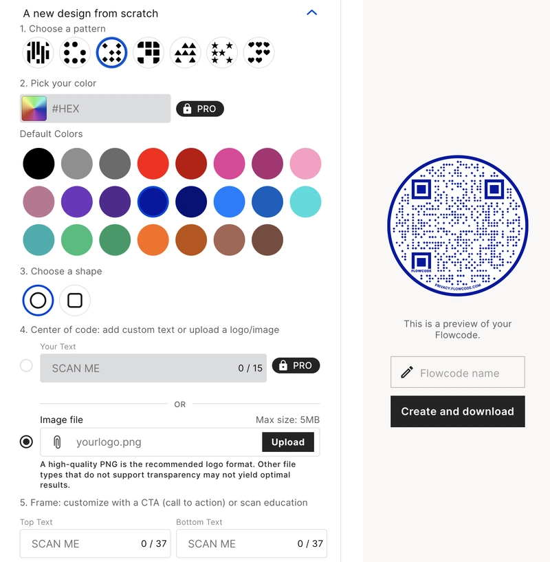
Let's compare 2 interfaces
The first one is a basic part of the Flowcode creation page that is available to the users
The next one is a part of the LLM Code generator.

The LLM code generator is a much more powerful tool—it can do everything the basic interface can, plus many additional advanced features that are not available with the classic interface. I know that, and now you do too. But what about a user who’s seeing it for the first time and doesn’t know what to expect?
Free-form input is incredibly powerful if you know how to use it, but it doesn’t offer tips, guidance, or help users decide what to ask for their first test request. That’s why most users click a help tile first.
At one point, we decided to test what happens if we add an extra widget tailored to each tile. Normally, adding extra steps reduces user conversion, but not this time. In this case, the additional steps increased engagement by helping users to learn what LLM was expecting from them.

We also noticed that the optimized messages generated with the improved user experience and additional inputs often became examples that users reused in their next requests. As a result, users became more successful with prompting and more satisfied with the output.
Model quality vs speed
Website performance is extremely important and has a direct impact on user activation. In AI development, it's a common challenge to balance model performance and output quality. And what defines "quality" isn't always the same for developers and users. That's why testing different models, behaviors, conversation tones, and features is so important. What we do know for sure is that users want to see the value as soon as possible. The response should align with their expectations, prove that the model understands their needs and language, and offer the tools they need to shape the final result.
This project reinforced a simple truth: real users behave differently from developers. Building an AI product isn’t just about the AI—it’s also about thoughtful UX. By listening to users, testing continuously, and staying flexible, we were able to create a smarter, more user-friendly experience: an AI-powered QR design assistant—or more accurately, a Custom QR design tool.