1. Our team will reach out in <30 minutes.
Check your inbox or phone, we’ll tailor your demo to your use case.
2. We build your custom demo
Flowcodes, FlowURLs, and FlowHubs with the data behind the whole platform - so you see exactly what Flowcode unlocks.
3. You go live in days
Our team handles setup. You handle growth.









.webp)

























.png)



.png)






.png)



.png)

.png)

%20copy%203.png)




.png)






Back to all articles
The best dashboard is the one you built yourself
September 22, 2026
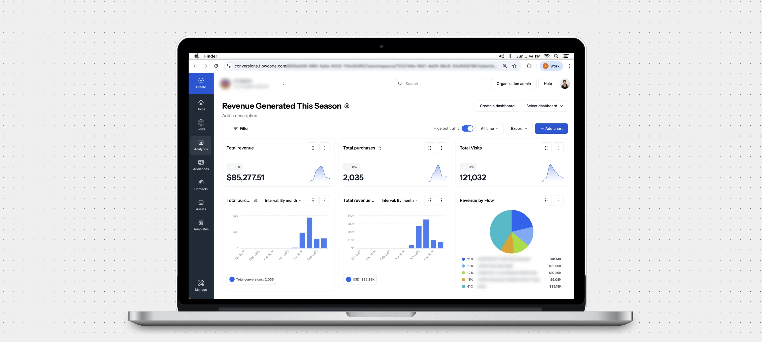

Custom Dashboards let any team build their own analytics view in Flowcode, with drag-and-drop charts and filters that answer the exact question they're asking.
Why we built Custom Dashboards, and how to think about the views actually worth building.
The request came in so many different forms that it took us a while to notice it was one request.
A retail team wanted connections broken out by store region, week over week. A media partner wanted a single view of one campaign, with everything else stripped out. Someone else wanted to know which day of the week their audience actually showed up, because they were about to buy media against a guess.
Different companies, different verticals, different questions, but the same underlying need: a cut of their own data that the product couldn't show them.
So we pulled it by hand. A CSV here, a custom report there. It worked fine, except that every one of those requests meant someone sat waiting a few days for a number we already had. That's a long time when you're deciding where next month's budget goes.
It made more sense to just let people build the view themselves. That's what Custom Analytics Dashboards do.
Every business measures success differently
This sounds obvious until you try to build one dashboard for everyone.
A CPG brand running codes on packaging cares about repeat engagement and geography. A sports team cares about what happened in a three-hour window on a Sunday. An agency cares about proving one campaign outperformed the last one. Those are not variations on a theme. They are genuinely different questions, and a standard reporting view answers all of them partially and none of them well.
The old tradeoff was that getting the exact cut you wanted meant exporting the raw data and rebuilding it somewhere else, or asking someone technical to build it for you. Both cost time. Both put distance between the person with the question and the answer.
Custom Dashboards close that distance. You build the view yourself, on a drag-and-drop canvas, from your live Flowcode data. No SQL, no ticket, no export.
Six ways to look at the same data
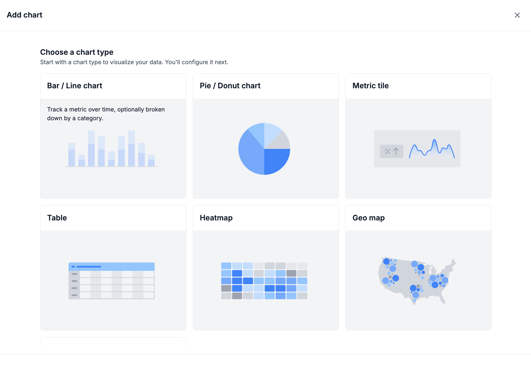
Choosing a chart type is not a design decision. It's a decision about what question you're asking. Here's the plain-language version of each.
Bar and line charts answer "what's the trend?" Connection velocity over time, week-over-week conversion, the shape of a campaign's ramp. This is where you see momentum, or the lack of it.
Pie and donut charts answer "what's the mix?" How much of your total volume is coming from one touchpoint versus another, one region versus another. Best when the story is proportion, not change.
Metric tiles answer "what's the number?" One figure, big, with a directional trend. These are what you put at the top of a dashboard so that anyone walking past a screen knows within two seconds whether things are up or down.
Tables answer "show me everything." When you need the full breakdown side by side, and you don't want it abstracted into a shape, this is the block.
Heatmaps answer "when?" Peak days, high-frequency hours, the windows where your audience is actually paying attention. Useful in a way that a line chart isn't, because density is easier to see than to read.
Geo maps answer "where?" Location-based connection distribution across your territory. This is the chart that most often changes what someone does next, because it makes an abstract number into a place you can send budget.
Three views worth building first
If you're staring at a blank canvas, start here.
Isolate one high-priority flow. Filter everything down to the small set of conversion journeys that actually matter to your quarter, and remove the rest. Most reporting problems are not missing data. They're noise.
Put this campaign next to the last campaign. Build side-by-side blocks comparing an active campaign to a historical benchmark. The number on its own means very little. The delta means everything.
Break it out by territory. Segment by region, then look at cost per connection by market. This is the fastest route from a dashboard to a budget decision.
The part that matters most
The real shift here isn't the charts. It's who gets to build them.
When reporting lives with a data team, the questions that get answered are the ones important enough to justify asking someone else for help. The small ones, the curious ones, the ones that turn out to matter, those quietly don't get asked.
Give a marketer a canvas and the economics change. The cost of a question drops to near zero, so more of them get asked, and better decisions come out the other side. That's the actual product here. The heatmap is just a heatmap.
Your Classic Dashboard View isn't going anywhere, by the way. It's one click away, and custom layouts sit alongside it rather than replacing it. You can also export any custom dashboard or schedule it to land in an inbox on a recurring basis, so the people who need the numbers get them without logging in.
Get started
Custom Dashboards are available now at the Workspace level for all clients. Open the Analytics tab, click Create Dashboard, and build the view you've been asking for.
.webp)
.webp)